The responsive ads offered by Google AdSense are the perfect answer to mobile web layouts. However, automatic sizing could be better. It sometimes displays sizes that don’t fit or might not even find a fitting size and stay blank. In this tutorial, I will show you how to set up an AdSense responsive ad by choosing custom banner sizes for each browser width without coding.
At the end of this tutorial, you won’t only know how to set up manual ad sizes, but I will also reveal a setup that performs well on most sites.
Table of Contents
I implemented the settings described here with our AMP Ads add-on.
Four problems with the responsive AdSense ad
Despite the benefits, four issues exist with the “smart sizing” of responsive AdSense ads.
- In some spots, AdSense couldn’t get the right size. It was either too small or sometimes so big that half of the ad was cut off. This was AdSense breaking its terms of service.
- Finding the correct size can fail, and the ad can stay blank. This issue could happen when the element the ad is in has no specific size, or the ad itself should float within the text.
- The smart sizing’s second disadvantage was that the fitting size is not always the best-performing size. A text ad can have almost any format, but the often better-paying image and rich media banners are bought for specific sizes.
- Another problem I had when optimizing the ad was that the reports didn’t show the specific sizes. Maybe you didn’t know, but there is a difference between the ad size and the creative size. The ad size is a kind of reserved place. The creative size is the one of the elements displayed in this space. This size can be smaller than the ad space or more extensive, as it sometimes happens with the responsive ad unit.
The solution: manual ad sizes
To overcome all the problems with smart sizing and still be able to use AdSense responsive ads, one can define the sizes for each device width. The result will be:
- The ads won’t stay blank.
- The ad’s sizes fit (because you defined them).
- You can specify the best-performing ad sizes.
- You can analyze the performance of each creative size in the Google AdSense reports.
In the rest of this tutorial, I will show you how to manually set up the responsive ad sizes without any need to code.
Ad Settings
1. Create an AdSense ad
First of all, you need an AdSense ad. Follow the manual about the AdSense ad type in Advanced Ads to set it up. When you create the ad in AdSense, choose the “Responsive” ad format.
2. Choose the AdSense “Responsive” Type
If you create the AdSense ad manually, choose the Responsive ad type.
You should see the Resizing option when you have installed and activated our AMP Ads add-on and imported a responsive ad from your AdSense account. Switch it to “advanced”.

3. Define the sizes
After you selected the “advanced” mode, you should see a table like the following.
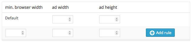
You should first select the default ad size in the first line. This will be the ad size displayed starting on the smaller devices.
Use the following line to add new sizes. Therefore, enter the minimal device or browser size into the first field the ad’s width, and height in the second and the third field. E.g., if you want to display a Medium Rectangle (300x250px) as the default size and a Full Banner (468x60px) on devices bigger than 500px, your form should look like this:
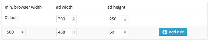
Submit the form to save the values and be able to add more sizes.
A well-performing default setup
For ads within the content – a generally good performing position – this is a good setup to start with:
| device width | ad width | ad height |
| default | 300px | 250px |
| 360px | 336px | 280px |
| 960px | 728px | 90px |
You need to check this in your frontend. Chances are that your site has a margin that is larger or smaller and therefore might squeeze the ad or if your sidebar is large, the Leaderboard might not match at 960px but only at 1020px or even not at all.
How to get the correct size?
To set up the correct responsive size, you need to know the size of the target device browser and the size of the element the ad is inside. There are several tools and tutorials about this; here are just a few.
Browser size
You don’t need to test on different devices. Make your normal desktop browser smaller.
- Chrome: you should see the window’s dimension while resizing it.
Ad Size
The Responsive Ads add-on now comes with a frontend assistant that displays the window’s size and the ad’s container, making choosing the fitting ad size a lot easier.
To get the possible ad size, check the available size of the placement using tools like:
- MeasureIt Add-On for Firefox
- MeasureIt Add-On for Chrome
- Get computed size of an element in Chrome without an add-on